Does it ever feel like you and your graphic designer are speaking completely different languages?
Here are five terms designers commonly use and that you, as a small business owner, can employ to more effectively communicate with them.
1. Above the fold
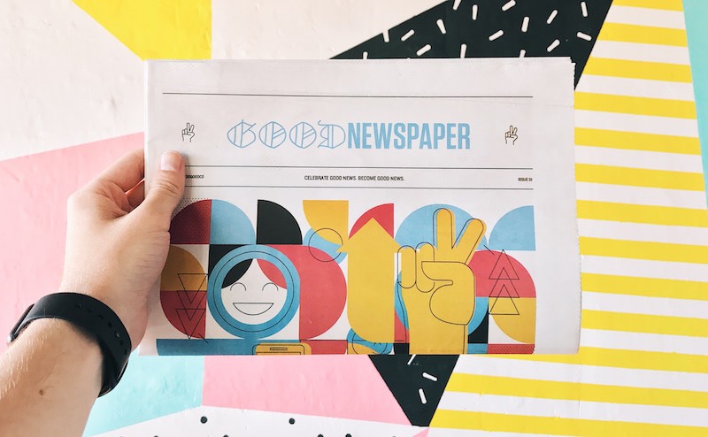
This term originates from the newspaper industry, where all the content that appears before a newspaper is unfolded is considered to be “above the fold.”
Now this term is commonly applied to websites and refers to all the text and images that appear before the user has to begin scrolling. What content you choose to show above the fold is an important marketing consideration.
2. Hero image
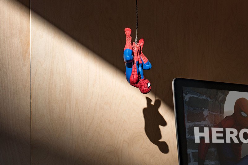
A hero image is an element you often find above the fold on a website. It’s a very large image, typically a photo but it could also be an illustration, that takes up much of the screen and is especially prominent.
💡WEBSITE INSIGHT: It takes just milliseconds for visitors to your website to make an impression about your business. (Does this company seem professional? Is this a place where I belong?) The hero image is the very first thing a visitor will notice about your website. So make sure it looks professional and helps communicate what you do and who you do it for.
3. Serif and sans serif typefaces
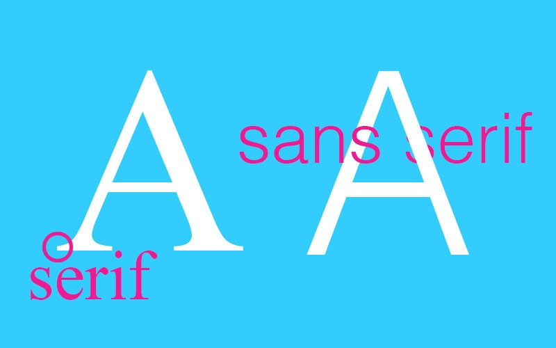
First things first: you might refer to a typeface as a “font,” but a designer typically talks about “typefaces.” Why? Because a font specifically refers to a typeface that’s used on a computer screen, like your laptop or your mobile phone, while “typeface” is a more general term that also applies to printed materials.
A serif typeface is the kind that has some extra detail on the letters, often resembling little “feet.” Serif typefaces are easy to read even in smaller sizes, making them the most common typefaces for the main body text in newspapers and books. Popular serif typefaces include Times New Roman and Garamond.
Sans serif, on the other hand, literally means “without serifs.” These typefaces lack the extra adornment of serif typefaces and are sometimes perceived as more modern. You’ll commonly see sans serif typefaces in headlines and on websites. Popular sans serif typefaces include Helvetica and Futura.
4. Color profile
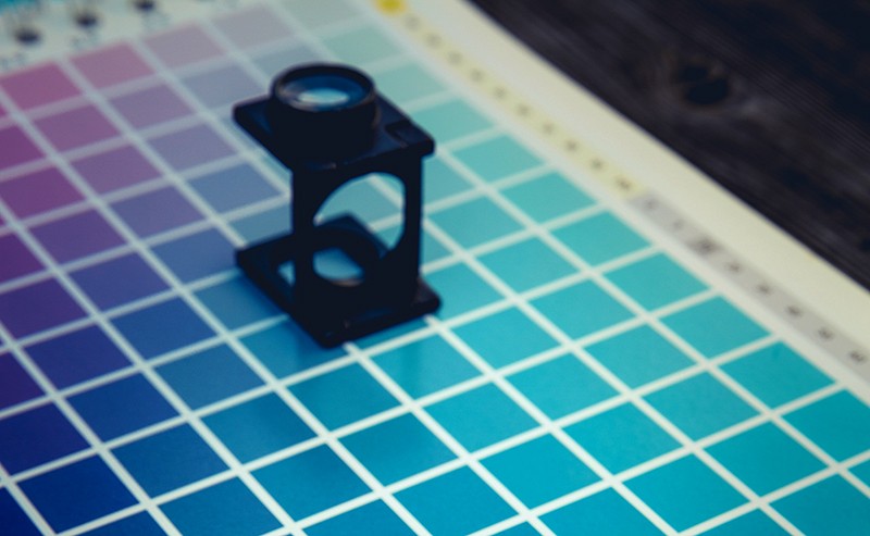
There are a number of different color profiles and the most appropriate one depends on how the final work will be seen.
- Creating a printed piece, such as a postcard? Then all your images will need to be in the CMYK color profile because printers use cyan (C), magenta (M), yellow (Y), and black (K) ink.
- Working on a project for the web? Then you’ll want your images in RGB (because screens think of colors as percentages of red, green, and blue) and you’ll want to specify your typefaces, borders, boxes and such in HEX. HEX is a six-character code that defines colors for websites.
Fun trivia! Guess what colors these common HEX codes stand for: FFFFFF, 000000, FF0000? (Answers are below.)
5. Vector images
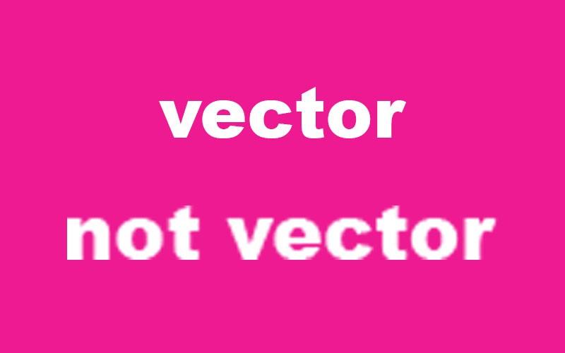
At some point, you’ve probably been asked for a “vector version” of your logo. What is that?!
A vector file is one that is still editable by illustration software, such as Adobe Illustrator, and can be scaled up or down without losing any of its resolution — meaning that it won’t get blurry when it’s resized. That’s why it’s important that you have a vector version of your logo available to you.
Vector images are often saved in the file types .AI (which stands for Adobe Illustrator), .SVG, or .EPS.
TRIVIA ANSWERS
What are these HEX colors?
ffffff – white
000000 – black
ff0000 – red
Seriously, who could have guessed these? :)